BBC WORLD SERVICE
A desktop-first UX and UI refresh for the world's largest international broadcaster
CLIENT
BBC World Service
ROLE
Lead UX Director
Lead Art Director
DATE
2018
BRIEF
BBC World Service is the world's largest international broadcaster. They required a massive overhaul of their website that would successfully cater to the needs of an international audience.
The challenge was to create a better experience for users across the globe with minimal access to mobile devices and fast internet connections. With the option to translate the website to more than 40 languages, it was crucial to design an interface that would accommodate this.
Secondly, BBC World Service's internal content team were in dire need of a new CMS, so I took an atomic design / modular approach, creating flexible building blocks that their team could quickly and easily piece together.
User Stories, and Jobs to be done
The client had a lot of user insights via their existing onboarding and sign-ups. With this data, and with some internal interviews I was able to build up a picture of the three core user types.
I began to script out top-level user stories that we collaboratively bulked out during a kick-off meeting on-site at the BBC Broadcasting House, London. Here I was able to gain further insights as to their requirements at a CMS level.
This enabled us to create more specific Jobs to Be Done (JTBD). I would refer back to these jobs to be done as the project progressed, ensuring we prioritised the business requirements alongside the users needs.
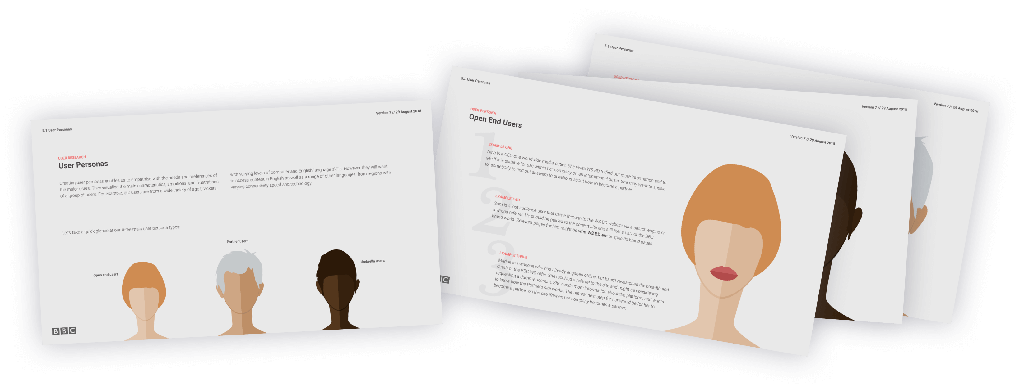
Creating even simplistic user personas can give a more human feel to who your core users are
User Journeys
Pinpointing the exact jobs our users want to achieve, I was then able to create user journeys, from the moment the user lands on the website, right through to their potential goals. We want to take care of these journeys, ensuring they can achieve their tasks quickly and smoothly. I refer to this as creating a narrative flow through the website, empowering users to reach the end of their own story.
Multiple user journeys were created, built around our previously created user personas and jobs to be done. At the most basic level, if you're unsure who your users are, you might want to focus on a first time visitor to your website, versus a regular logged-in user. How should that look? And how might those two experiences differ? This is essentially how we build out our stories and journeys, by asking these hypothetical questions until we are satisfied we have verified all.
Site map and Architecture
Working closely with the developer, we created an internal hierarchy for all content to sit. This hierarchy was then referenced into a page structure, which I implemented directly into a new and improved website architecture.
Visual representations were discussed internally until we were happy with the flow of the content, various media types, and overall structure, fulfilling the business needs, technical requirements, and user experience.
High Fidelity Wireframes
I was then ready to create high-fidelity wireframes based upon our new architecture and user requirements.
Although we went through several iterations for the wireframes, below is a small handful of the final wireframes that I supplied to development for the build.
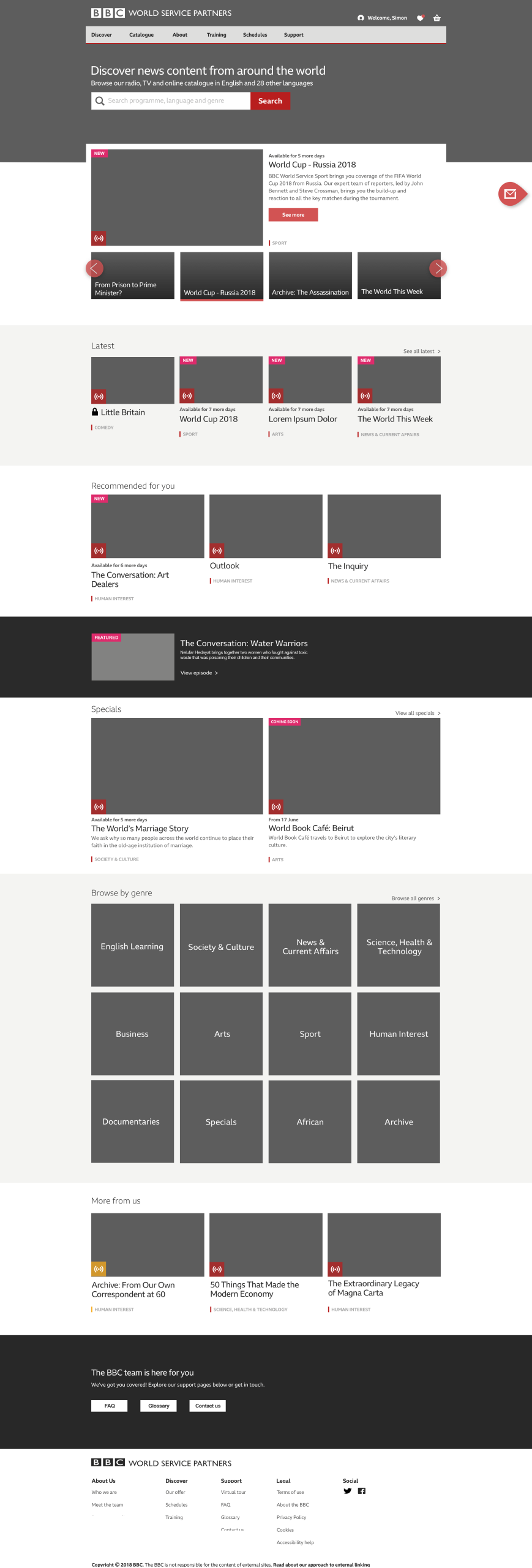
Home - Logged-in user
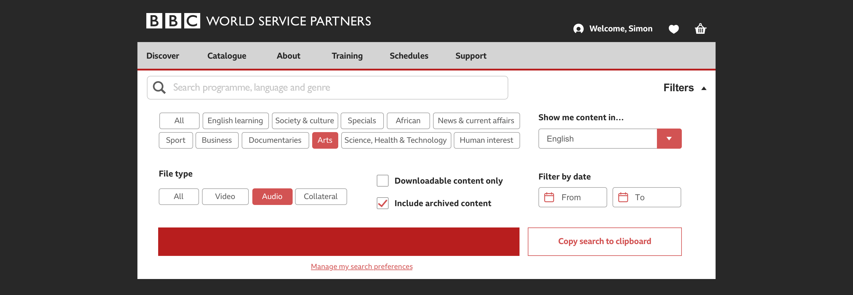
Search filtering
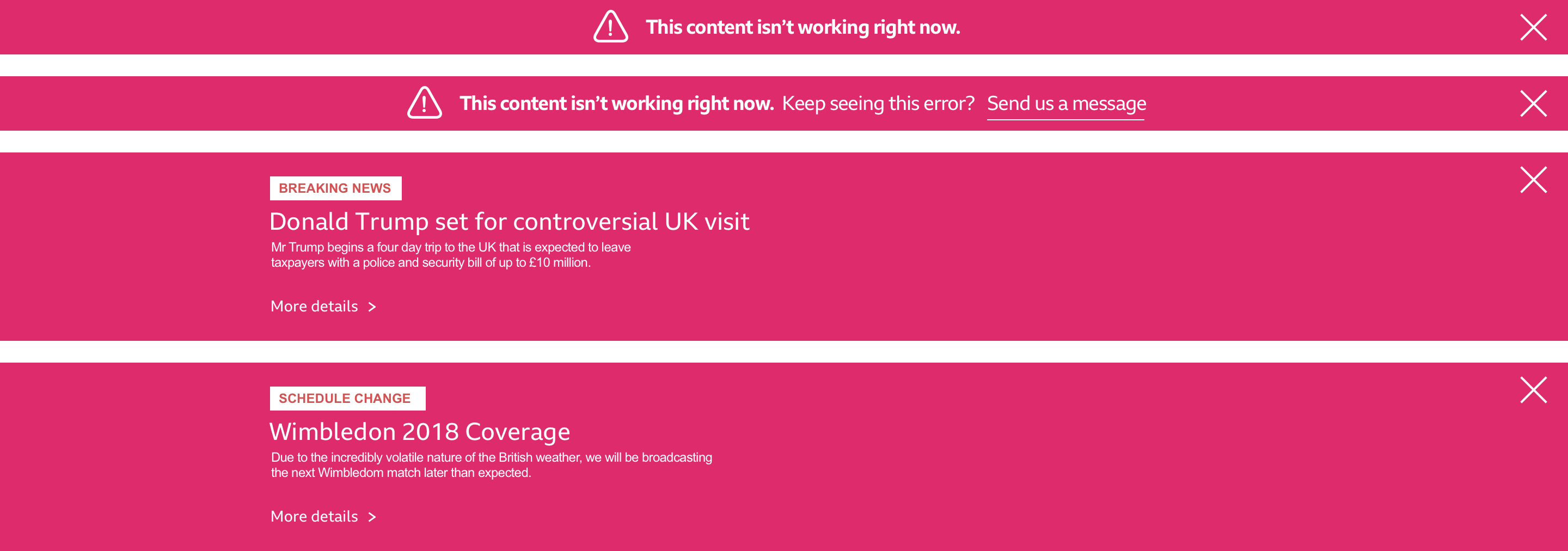
Various alerts

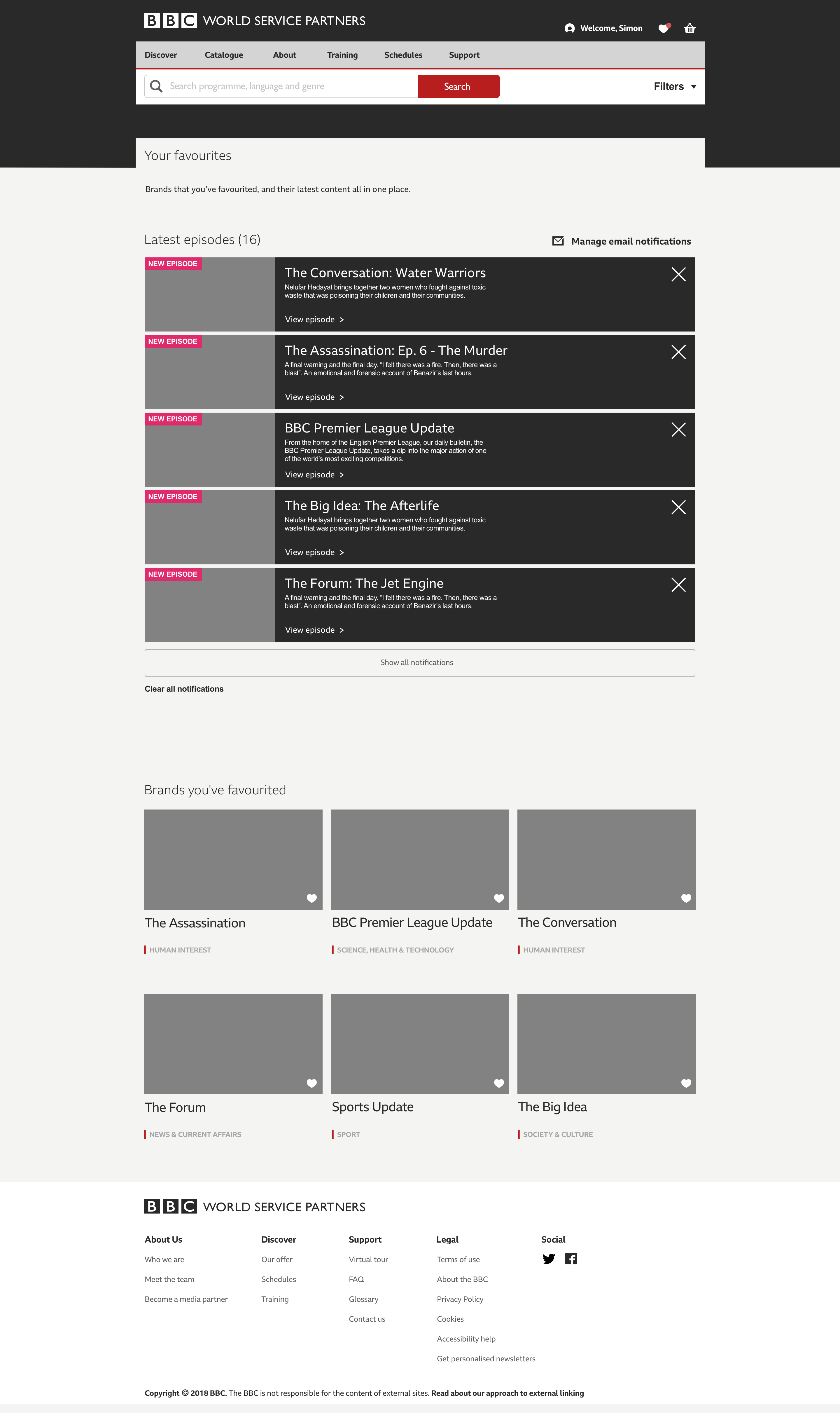
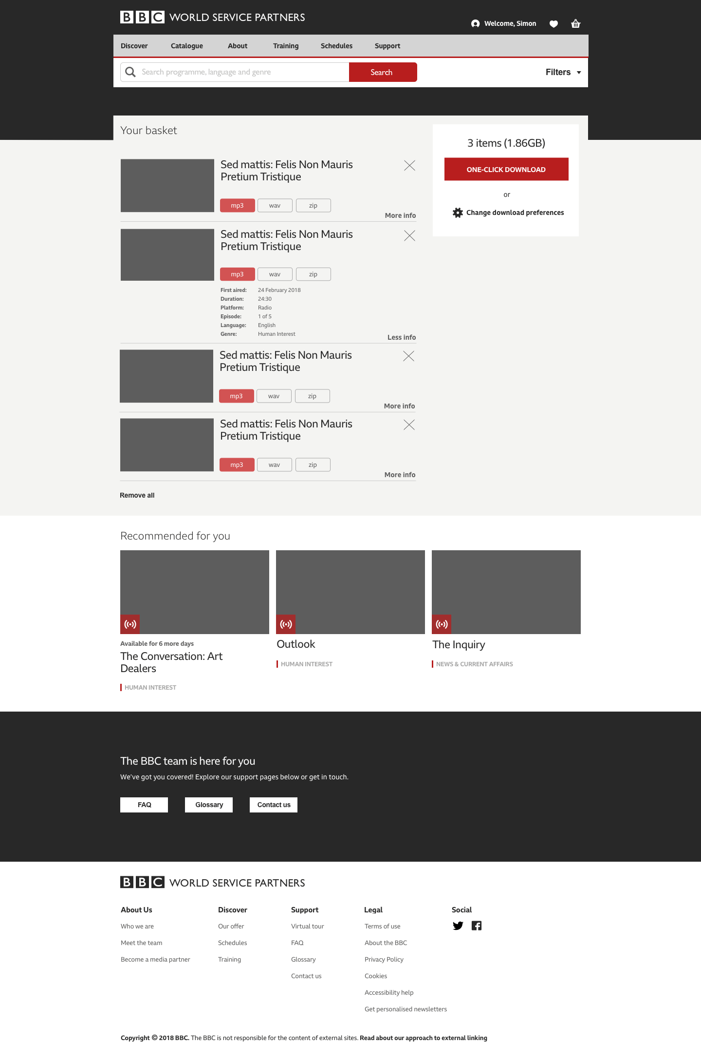
Search results, Favourites, View Basket
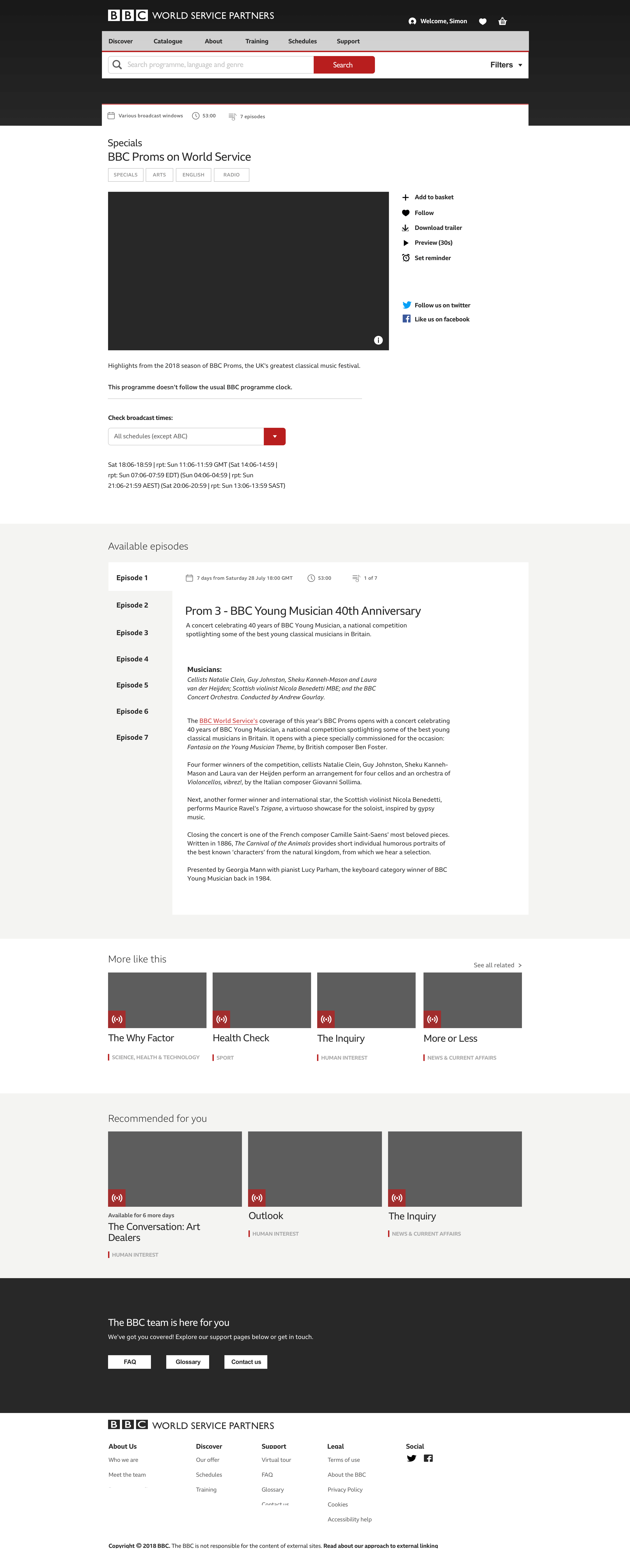
Detail page with Episodes block
Visual Design
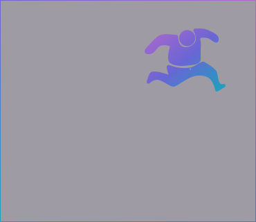
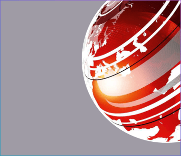
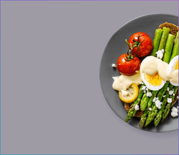
All video, audio, and copy content sat beneath specific genres. The header shows a key visual for the genre, offering further guidance to the user as they navigated. These images are low resolution to cater to our users across the globe with slow connections.
There was some flexibility to create new iconography that visually belonged to the existing BBC iconography set. I worked as closely as I could to the BBC Brand Guidelines and Accessibility Guide to ensure consistency.

Home
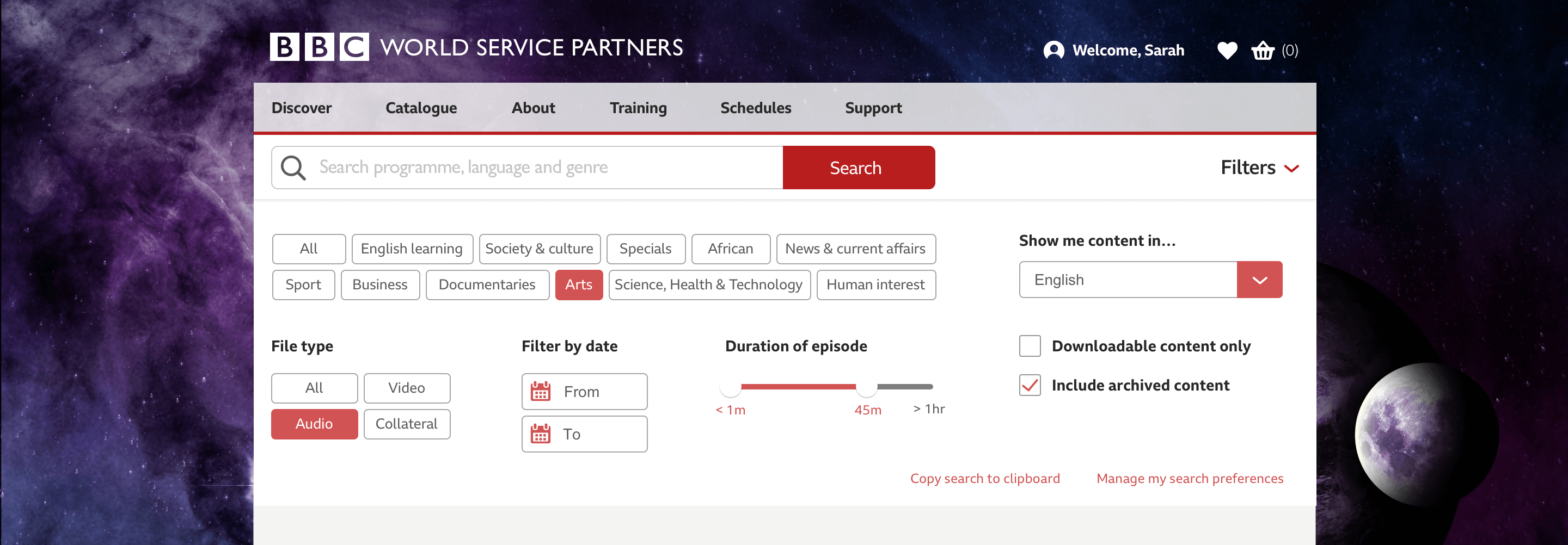
Search filter
I introduced a new colour to the palette that allowed users to differentiate between BBC World Service's current content (red) and archived content (yellow). This is seen in the items' teaser card genre label and media type block.
Detail page


Made with ❤︎ and ☯︎. Copyright Jessica denHeyer 2020 - 2023. All rights reserved.
Made with ❤︎ and ☯︎.
Copyright Jessica denHeyer 2020 - 2023. All rights reserved.