WWF
Concepting an app to educate travellers how to recognise and avoid purchasing items relating to animal cruelty when abroad
CLIENT
WWF
ROLE
Creative Director
UI Designer
DATE
2017
BRIEF
The World Wide Fund for Nature (WWF) is an international non-governmental organization, working in the field of wilderness preservation, and the reduction of human impact on the environment.
We were invited to pitch a concept and wireframe to WWF for a native app. It should inform and educate travellers specifically about souvenir-related animal cruelty. The main bulk of the content already existed as a PDF and printable leaflet, but the client needed something way more travel- (and user) friendly.
Initial concept phase
I scoured the briefing for any crucial information and noted down all requirements. Being a pitch, time wasn’t exactly on our side, so I decided to investigate no more than two ideas for the overall creative direction. Browsing their website and social media channels allowed me to get a stronger sense of who WWF are, and how they communicate with their audience.
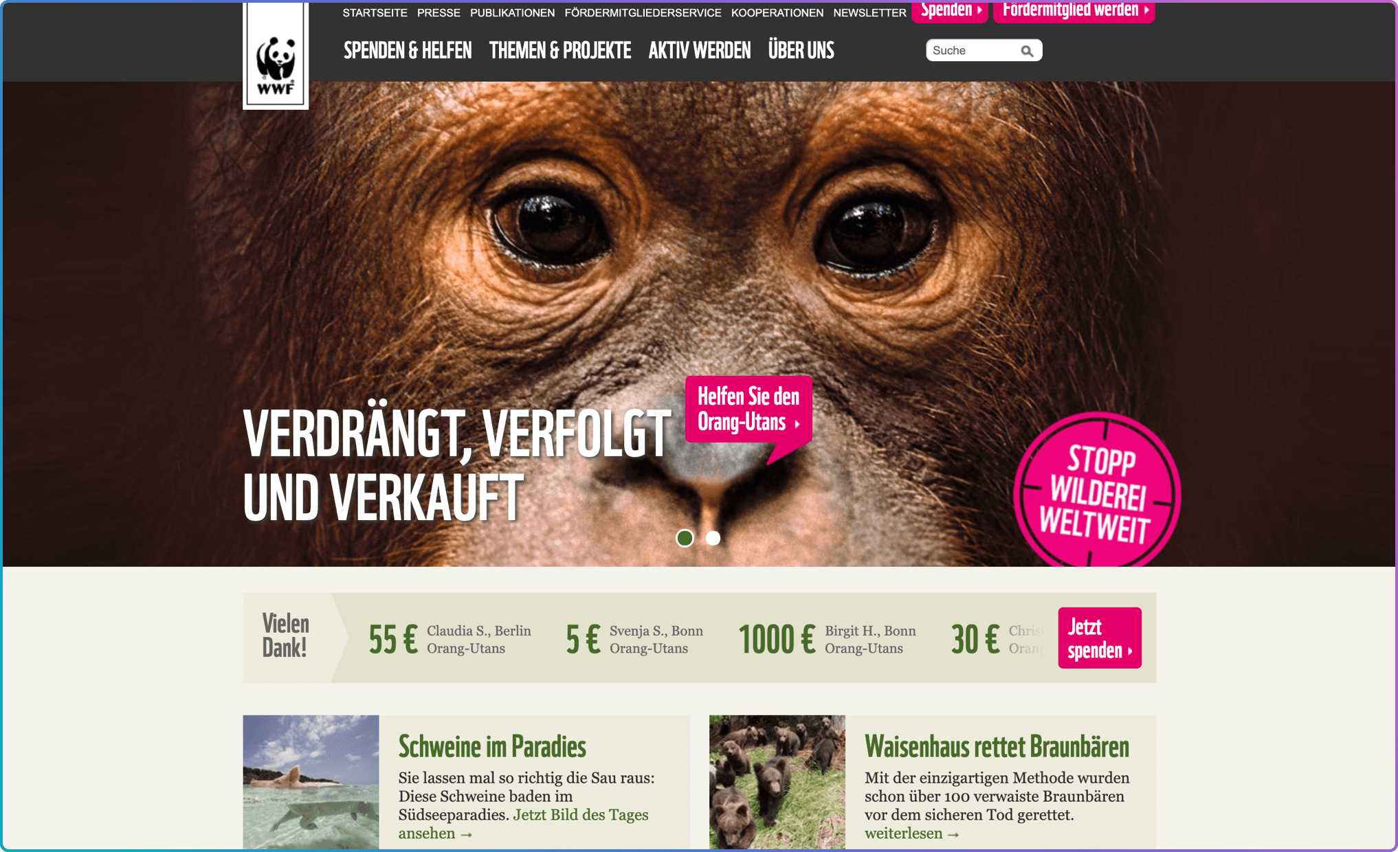
The WWF website (2017)
Their tone of voice was warm and friendly, yet firm - concise and straight forward with no nonsense. There was a simplicity to it that felt accessible to everyone, old and young alike.
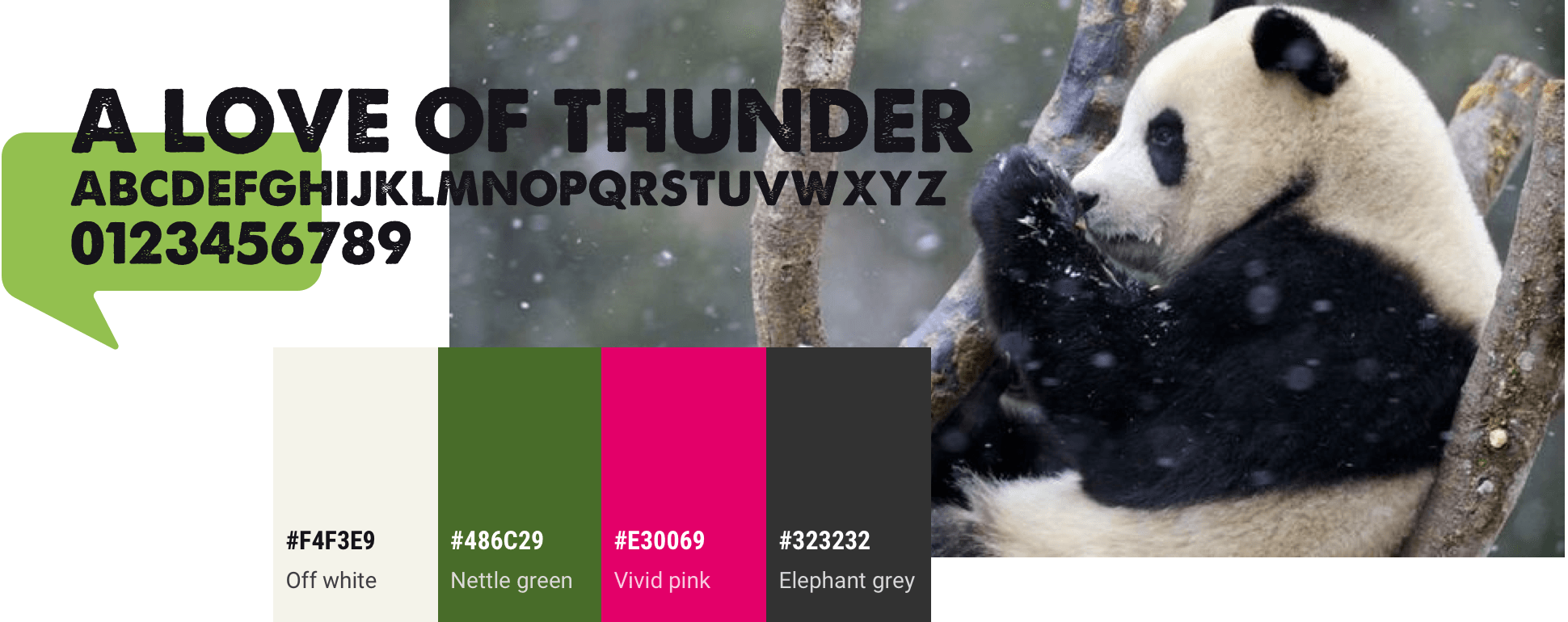
I wanted to maintain the WWF identity, so I took some key visual elements from their website - the bright pink call-to-action, the tightly spaced uppercase lettering from the main navigation, the rounded corners on the buttons, and their nature inspired palette. Unable to access their typeface (WWF’s own), I chose another font, one fitting to the primary palette, balancing well with their still photography. The typeface felt very in line with the curved elements, the eroded look giving an organic and wild quality.
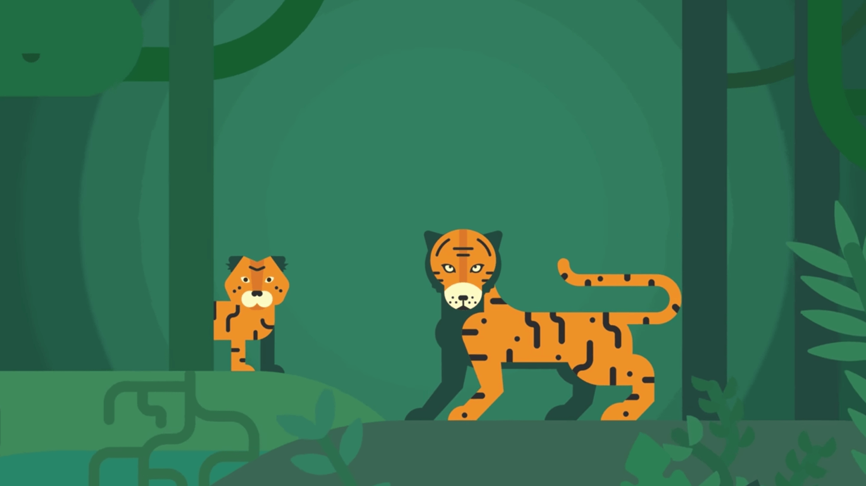
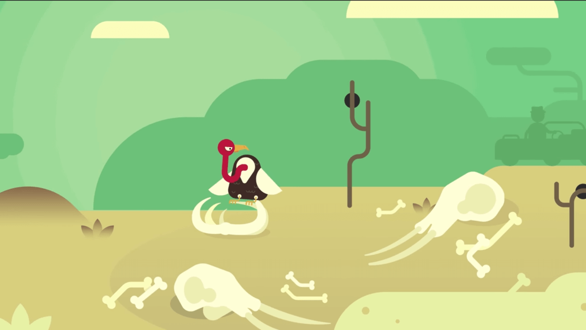
As I delved deeper in to their social media channels I found some fantastic video content that helped pull together my first idea. The video was filled with emotive still photography mixed with charming animations. It also covered a similar topic as the app, and had that same organic WWF colour palette. The pre-existence of the illustrations also benefited the client, as this would save design time and lower the cost at their end.
What's the big idea?
Taking the essence of the animated video, I wanted to recreate the illustrated world as the backdrop to real life photography and educational content. The illustration style is warm and inviting, and there’s no question that it belongs within the WWF brand universe. This friendly visual style should also help users to engage, encourage further learning and hopefully strengthen their ability to recall what they have read. The app should feel accessible for all. Shareability should play a small role too, meaning facts and articles can be shared with a friend, sent with a link to download the app.
The architecture of the app should be easy to navigate, with a strong search / filter functionality so users can access what they need quickly and comfortably.
And now for something completely different
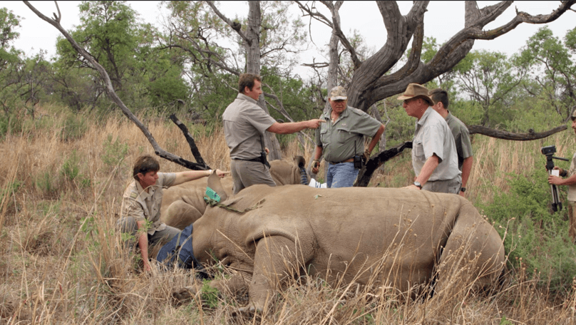
For the sake of contrast I briefly explored a second idea. I was envisaging the moodiness and movement of a typical Apple product page, with stunning photography and slick animations. The app should feel sophisticated and minimalistic. The focus should be on the subjects of the photography, with some elements being on higher z-axis points than others creating depth and a shocking realness. As we scroll down, we see a rhino on the ground, his hunters transitioning in from the sides with their weapons. A deep blood red masks the rhino’s corpse. The headline fades in to view. Scrolling further reveals captions and statistics related to the imagery. We educate the user through storytelling. And we engage the user with emotive content presented in a very slick way.
Quick mock up showing a more sophisticated concept for the app
And the winner is...
I liked the second concept. But it wasn't as connected to the WWF universe as my first idea. The visuals, tonality and personality felt disjointed from the brand. And what's more, attempting to rebrand the concept and forcing it in to that universe would be a bit like shoving a horse in to a onesie. So the idea ended up in concept graveyard. R.I.P concept number two (creative naming, I know). And on I moved to the next step: creating a simple flowchart for the app.
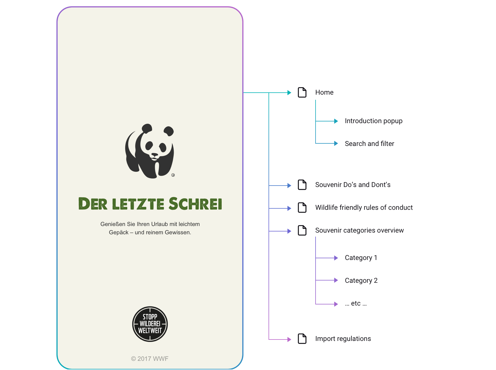
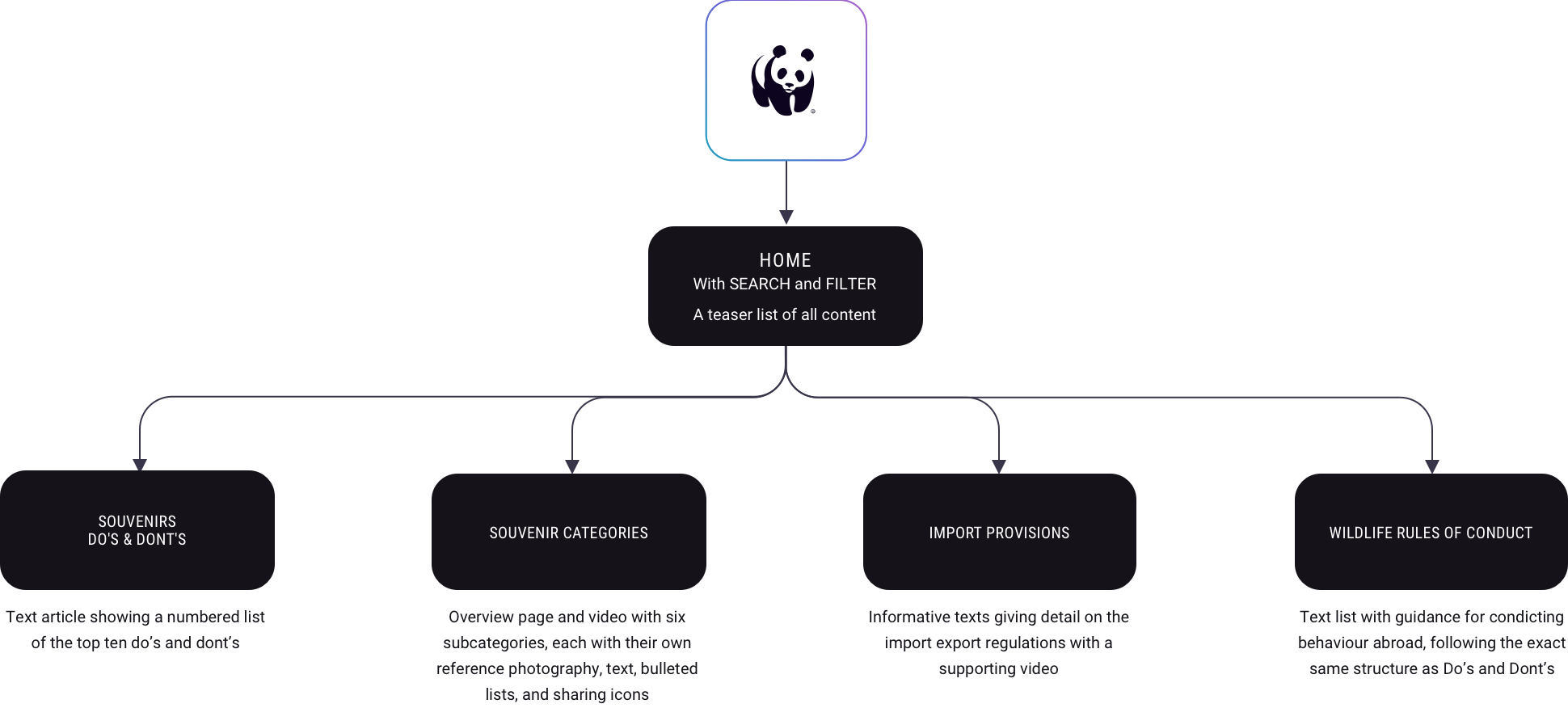
Finally, the witching of the wireframe hour 
Sketching out a few options for the navigation and home screen structure, I eventually opted to keep these in the burger navigation since we only have 4 article teasers on the home screen. As far as we knew, the client didn’t wish to add more content later down the line. But if that was the case, then we would have to look at the content on a wider scale, categorise it, and create a navigation appropriate for that structure.
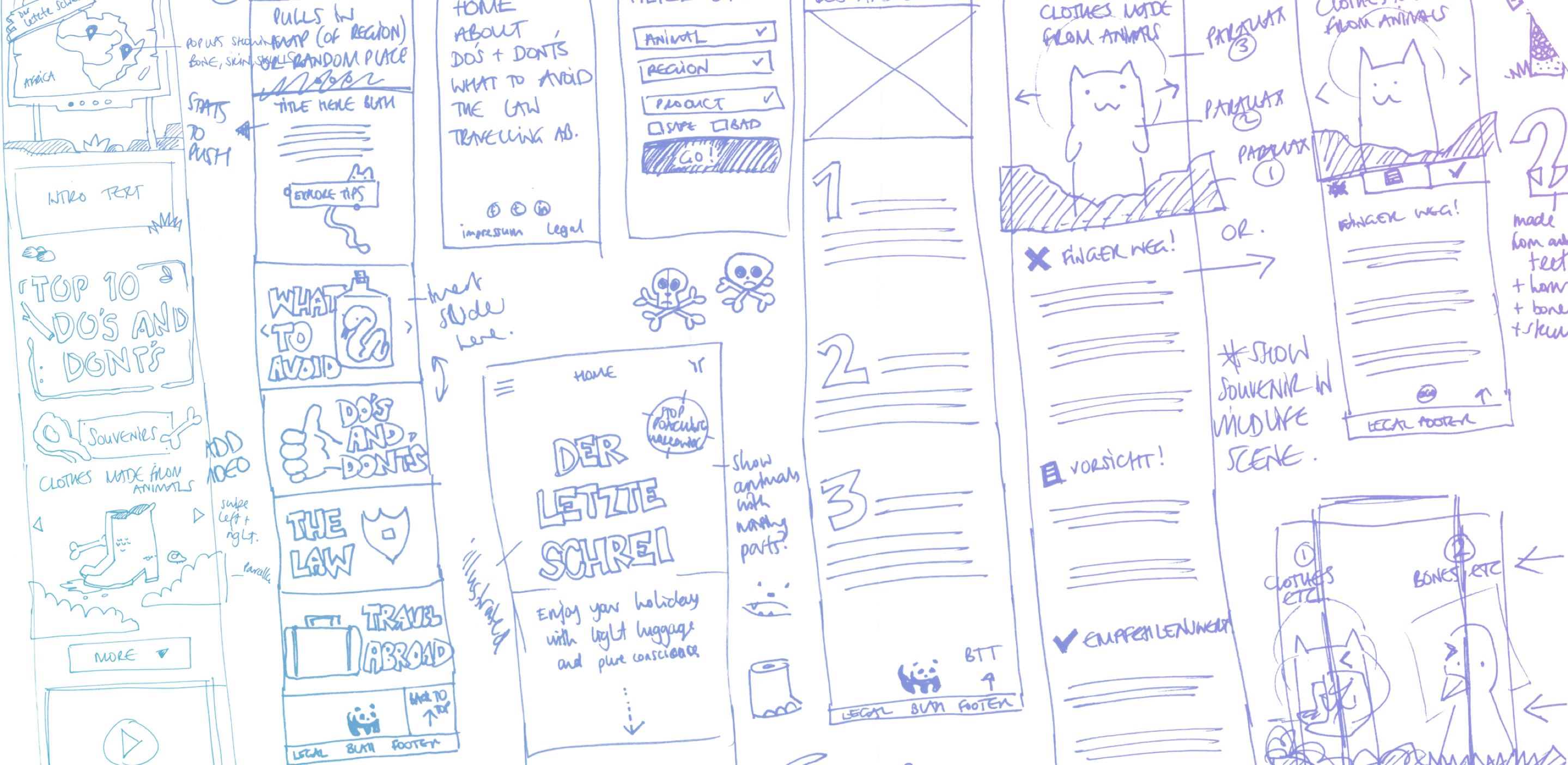
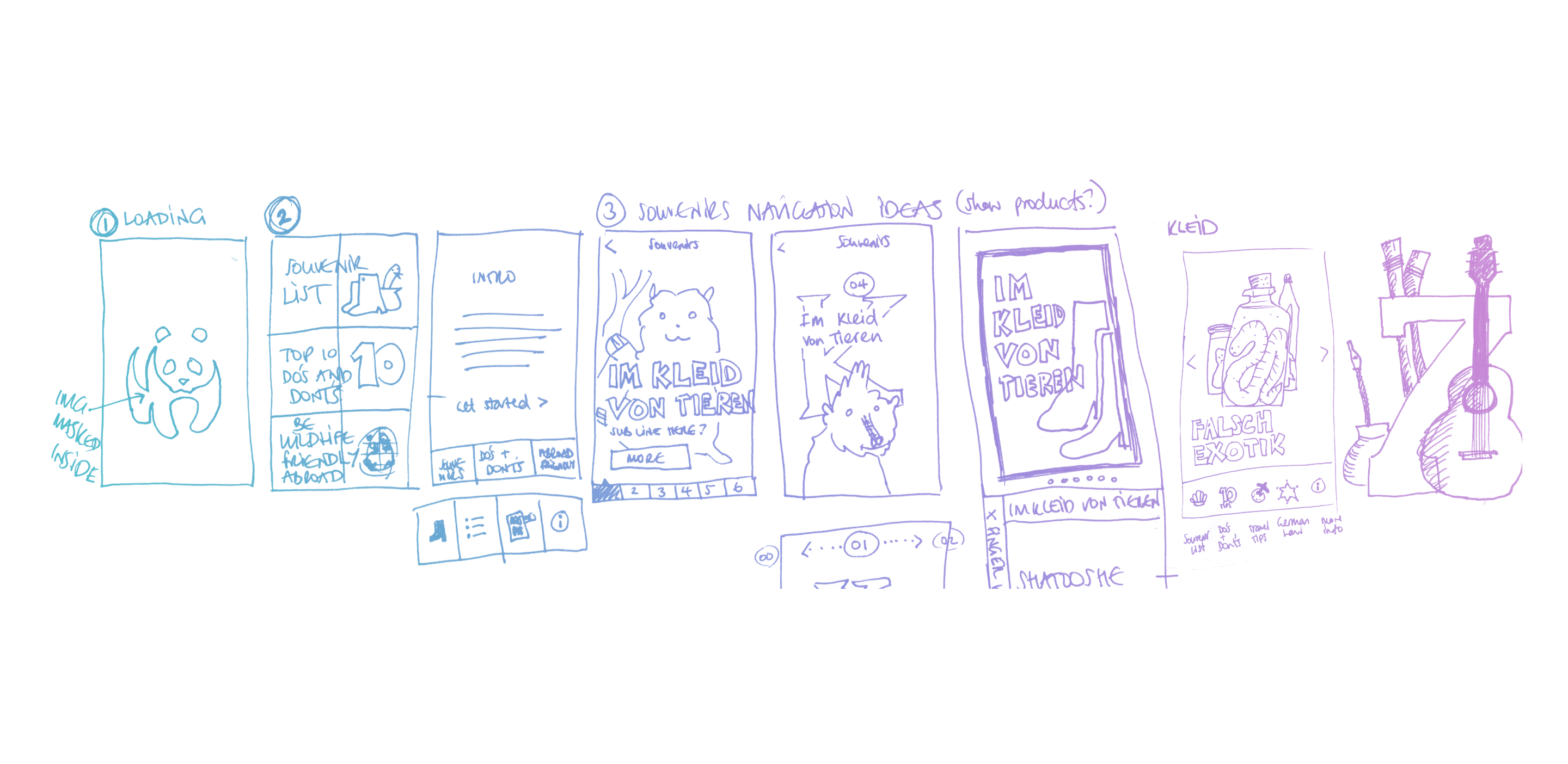
Some early wireframe sketches
Process overview
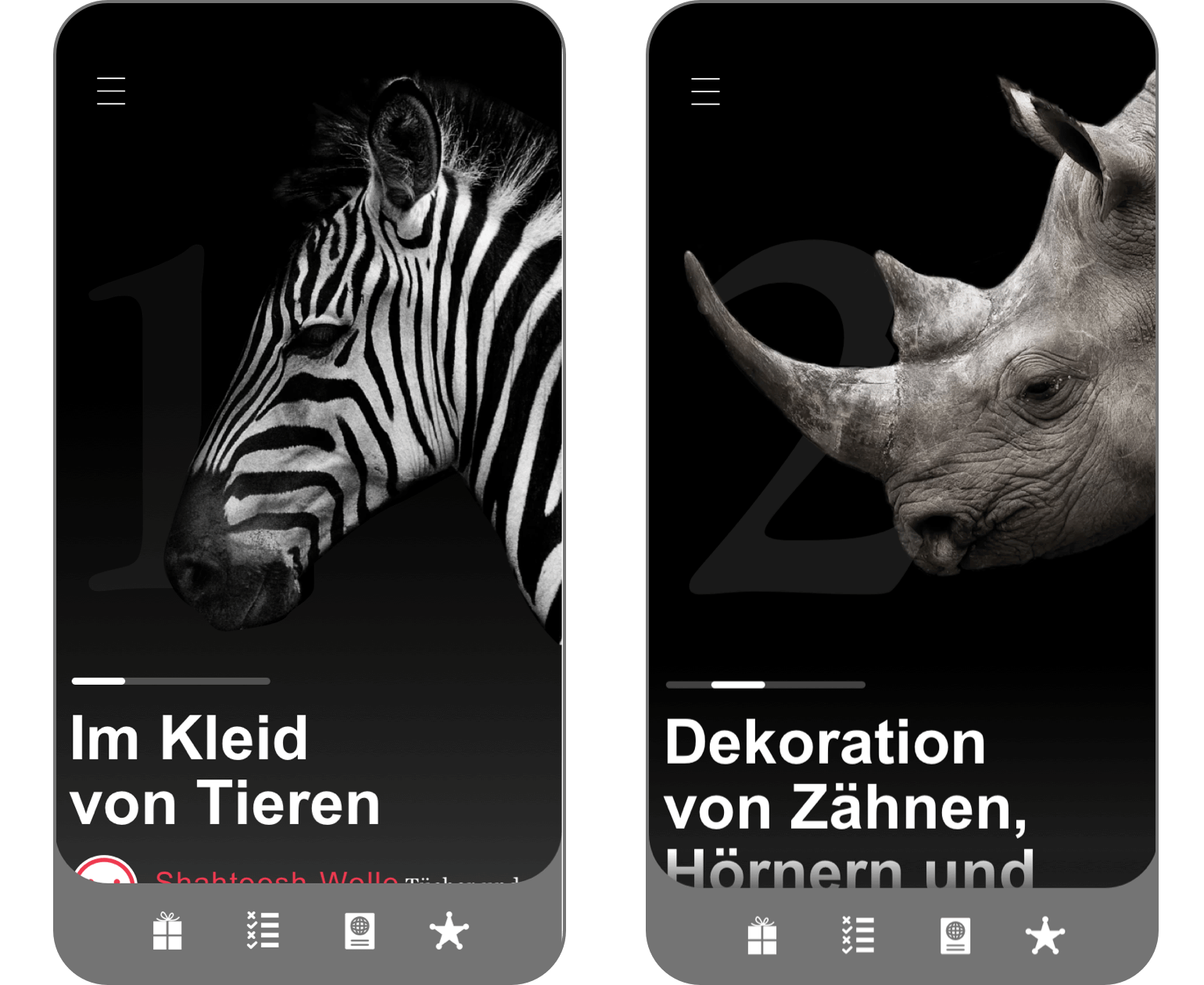
I took screenshots of the illustrated assets from the animated video, and cleaned them up in Photoshop, extending some backgrounds, and cropping others to fit within my wireframe. Some elements had to be redrawn as vectors in Sketch (the leaves, bones, trees) so I could position them flexibly. Other elements (the zebra-skinned boots and the numbers in the Do’s and Don't's list) I masked with similar textures, so they fitted seamlessly into the design. I created a cut-out paper vector graphic to position behind content, and finally I created shapes and elements that would tie the sections together with no harsh edges.
I worked with two palettes; the primary brand colour palette for call-to-actions, buttons, copy and titles, using the illustrated palette for backgrounds and art.
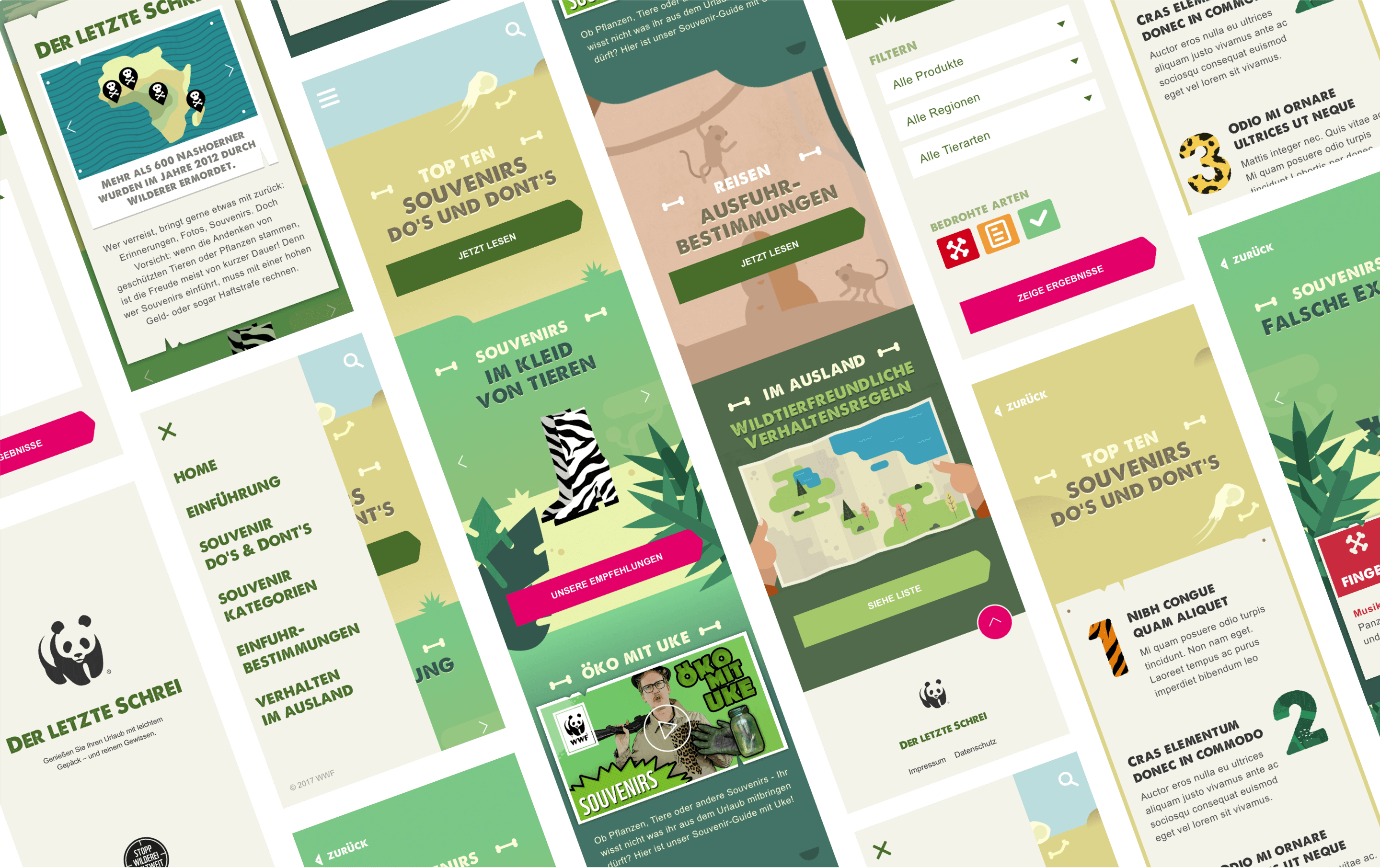
The final designs submitted to the client
Everything is submitted. Any last minute regrets?
Having turned this around in less than 16 hours, I wasn’t happy with a couple of small points. For one, the tabbed navigation I had created for the Souvenirs section. This essentially made the user work harder to see some very crucial information. The visual designer in me wanted to flout some cute looking paper-style tabs, while the UI designer was screaming “That’s a terrible idea.”
In that moment, I allowed aesthetics win over functionality but with more time I'd go back and change that.
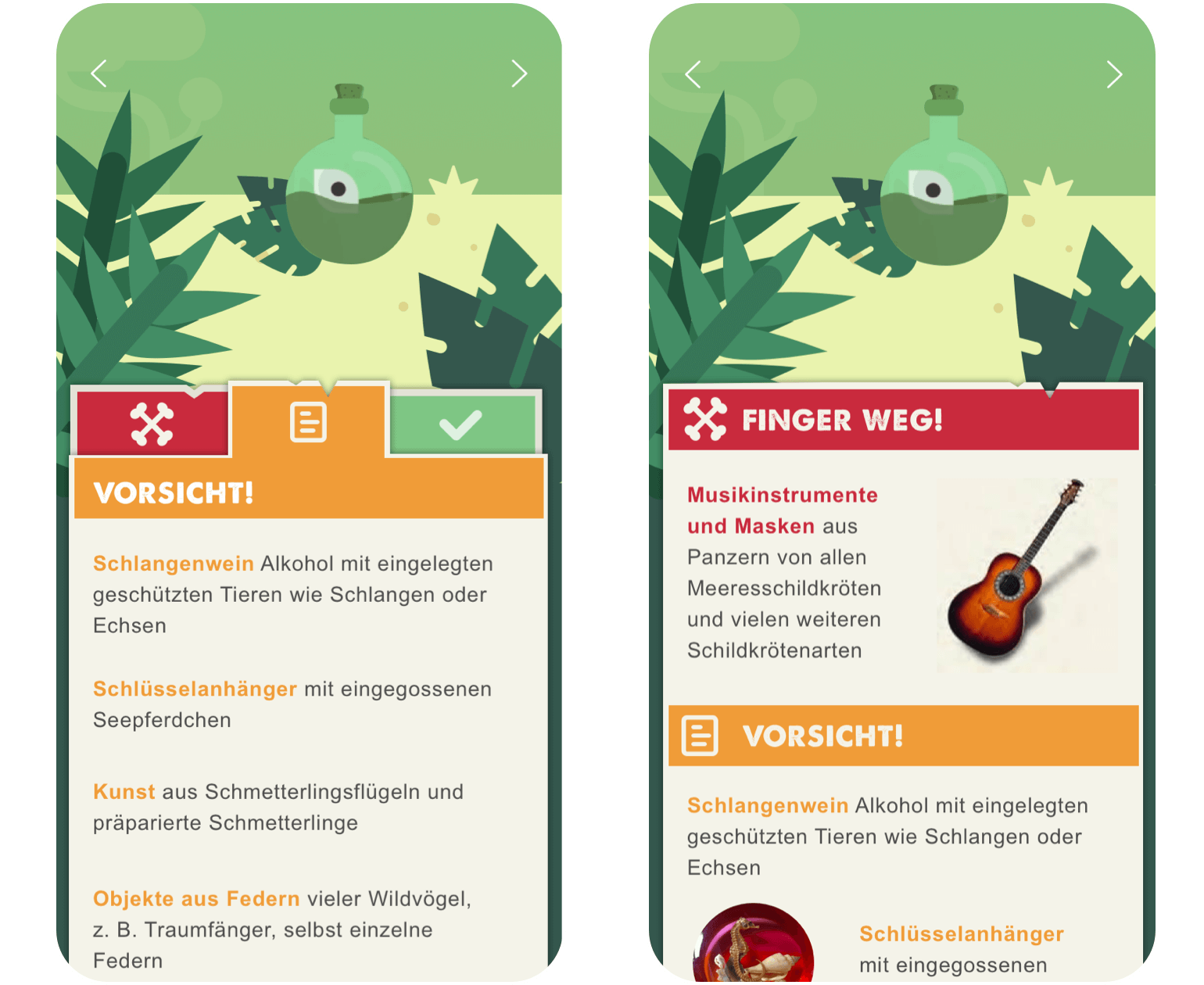
The tabbed navigation I submitted (left), versus the more user-friendly version (right)
This can happen especially with a limited budget or time restrictions. There is sometimes a compromise between functionality and aesthetics. With more time, I would have tackled this issue earlier and submitted the non-tabbed version.
Taking existing client assets like the illustrations I found in the video and re-using them also has its risks, but this enabled me to deliver fully designed screens, something I otherwise wouldn’t have had the time to do, and as a bonus, the client would save money on my design services.
All in all, an enjoyable project with an educational topic.
Learn more about the WWF souvenir guide
If you’re interested in the topic and want to read further, you can visit the WWF souvenir guide here. Once there, you can also download their app, which I highly recommend you to do - even if you’re not planning on travelling in the foreseeable future. There’s some excellent information in there. It only takes a little learning to help protect the world we share.


Made with ❤︎ and ☯︎. Copyright Jessica denHeyer 2020 - 2023. All rights reserved.
Made with ❤︎ and ☯︎.
Copyright Jessica denHeyer 2020 - 2023. All rights reserved.