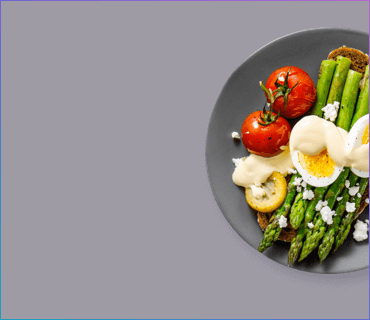
FOOD APP
Personal project exploring the right balance between usability versus unexpected layout
CLIENT
Personal project
ROLE
UX and UI Designer
DATE
2017
BRIEF
I really enjoy being surprised by small UX interactions, but only where it adds to the user experience, rather than taking away from it. The question is, can this work when a particular design pattern is so strongly engrained in to us? And what should we prioritise for the user, when creating an interface for a food ordering app?
Introducing ‘The 12-hour food-app experiment’.
Initial thoughts
I’d used one or two food ordering apps since moving to Berlin; Foodora (now merged with Lieferando) and Deliveroo (no longer operating in Germany). The market was over-saturated. But since Lieferando took over as food-ordering king in 2019, they’ve dominated the Berlin market.
I’d disliked the Lieferando app from the beginning. I’d found the filtering to cause frustration, and the restaurant selection screens to be badly designed - a focus on mostly illegible restaurant logos instead of food photography seemed like a bizarre decision alongside the clunky search functionality. They seem to be in the process of making some improvements to the app since I completed this personal project in 2017. But now it's 2020 and I'm still seeing these same issues years on.
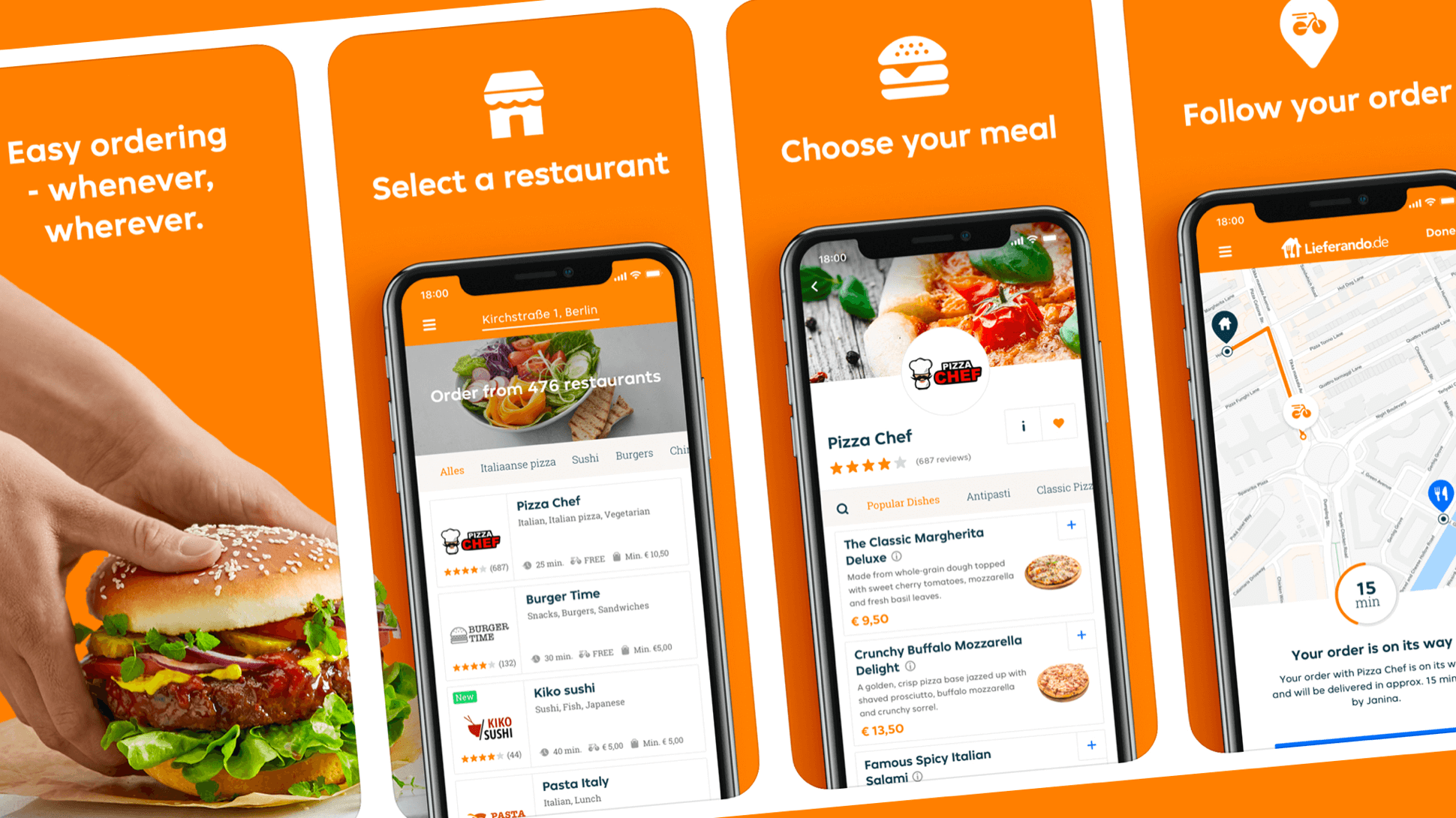
The Lieferando App as per 2020
I actually quite liked the UI of both Foodora and Deliveroo apps. The restaurant selection was visual (splash photography of dishes, providing huge visual cues for hungry users that didn’t want to rely on texts). The branding stood out and felt modern, even cool (vivid pink for Foodora and teal green for Deliveroo, which stood out against all the other samey looking orange-red food apps). The search functionality and filtering was strong (multiple ways to filter including dietary preference and delivery costs, alongside the possibility to search for restaurants and dishes).
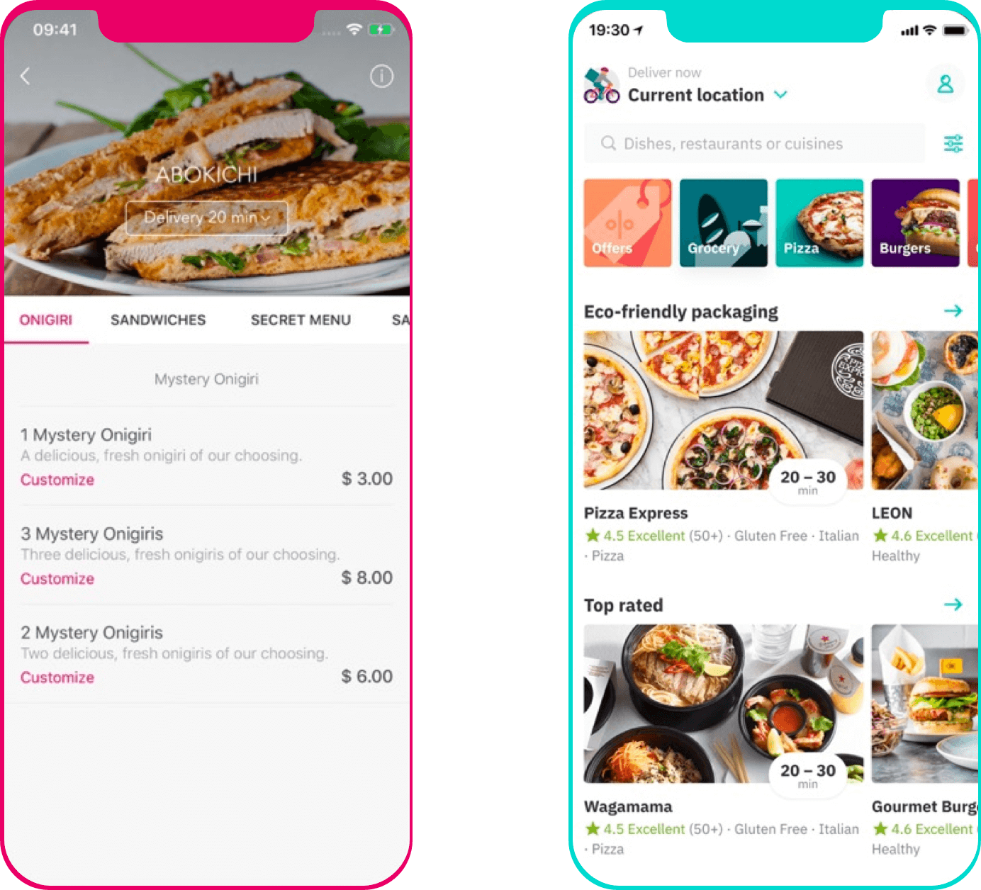
Foodora app (left) and Deliveroo app (right)
Twelve Hours of Food
I gave myself twelve hours to complete the experiment so my focus would be on the screen flow once a user had already selected their restaurant of choice. I figured I’d throw myself in the deep(fried) end, start with sketching out some rough wires, and tackle any issues as they arose.

Initial sketches to get a sense for the menu and product detail screens
I kept it pretty simple, exploring just a couple of options for the restaurant menu and product detail, investing more time on a site map.
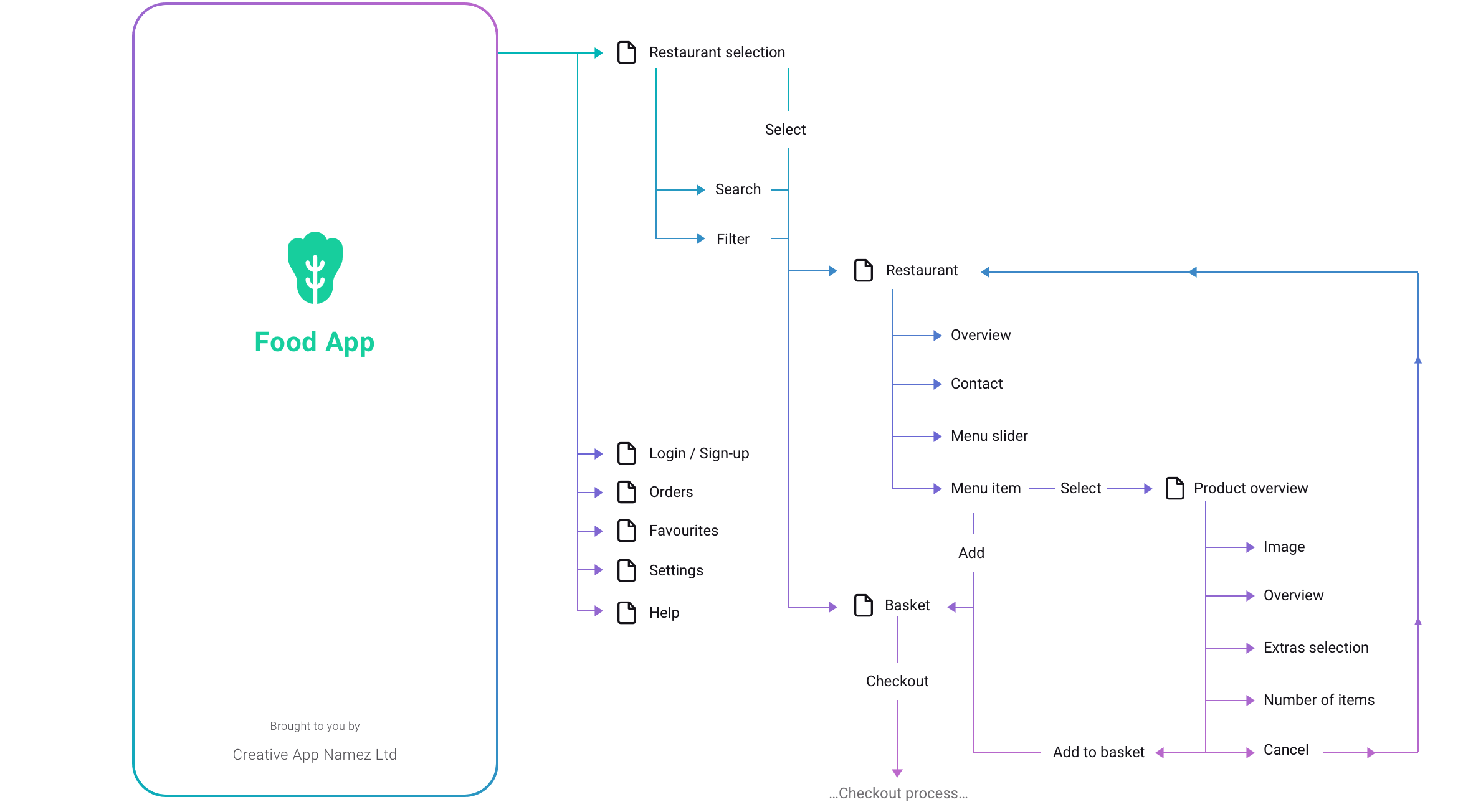
Site map showing a basic journey through a food ordering app
Focusing on just the site map of the Restaurant and Product Overview screens, I went on to create more detailed wireframes for the Restaurant screen; one variant based on Lieferando's list layout, and a second variant loosely based on Deliveroo's grid structure.
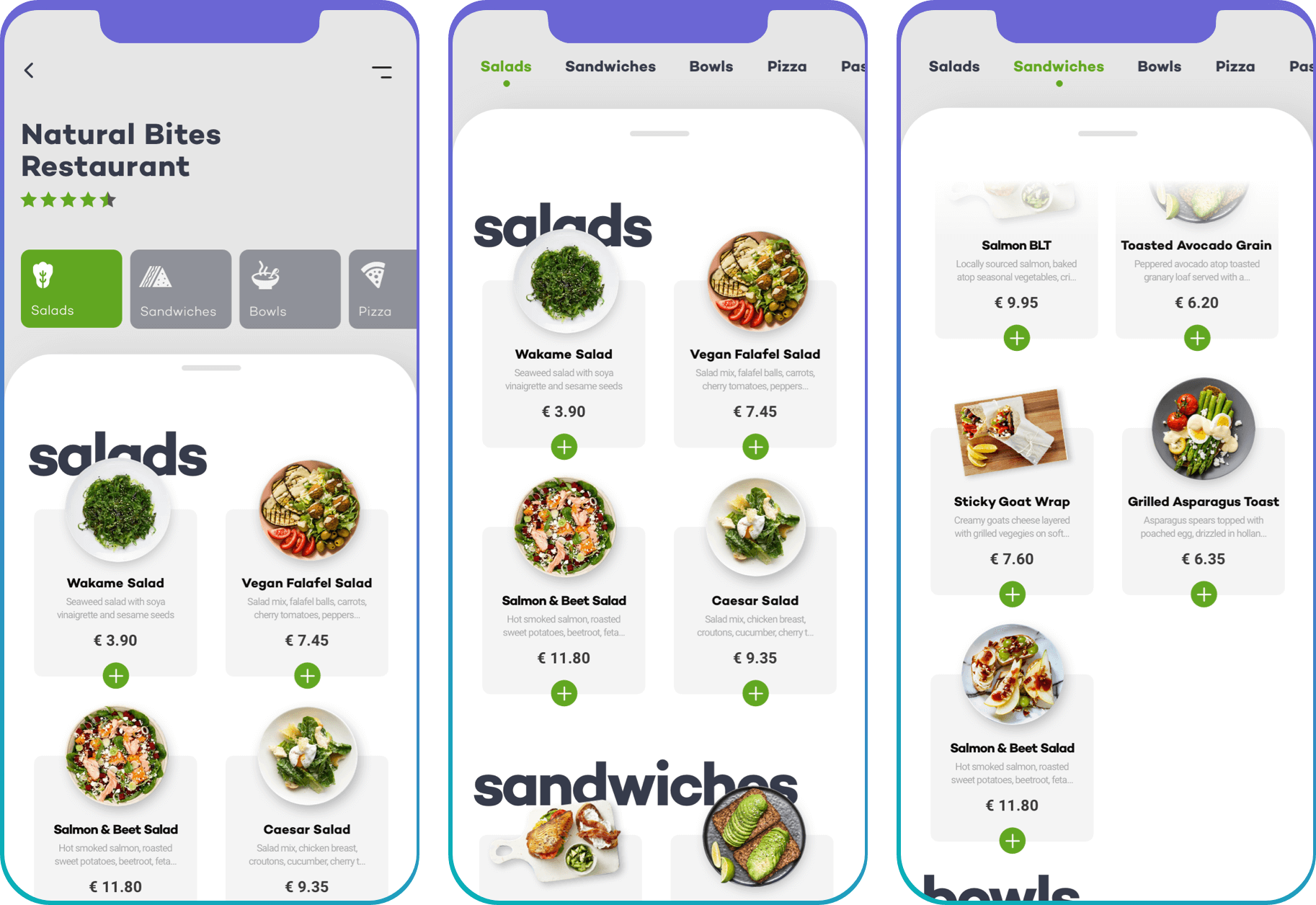
Wireframe #1 - List Inspired Layout
The restaurant header contains the restaurant logo with the option for a background hero image. Beneath this, a short description of the restaurant, user ratings (star system), restaurant tags (vegan, Italian, desserts, etc), contact info with call-to-actions (call us, book table, email us) and a personalised quote from the owner. I ended up positioning most of these elements under the burger menu, to declutter and focus fully on the food.
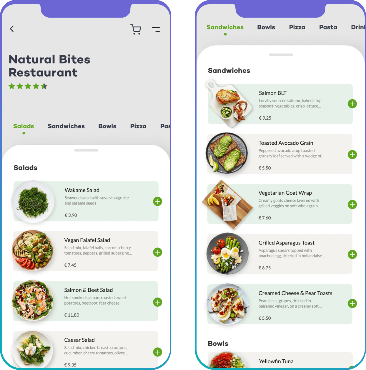
The menu categories; sticky to the top of the screen and jumping to anchor points in the menu on tap
A horizontal category slider (displaying starters, soups, rice dishes, drinks etc) sticks to the top of the screen on scroll, and jumps down to specific category anchor points when tapped. A small thumbnail of the dish is shown, alongside the usual title and short description. To save time, dishes can be added to the basket directly without having to visit the items’ detail page.
Wireframe #2 - Grid Inspired Layout
And so we move on to the less obvious layout. I kept the basic structure the same, but changed to a more graphical view with larger titles, a more prominent category slider, and a grid layout for the dishes. Let’s compare these two wires, and see if we can figure out exactly why one functions better than the other.
The grid-inspired layout presents the dishes nicely, but makes it a little harder for the users eye to explore
Overall, this layout felt less expected or popular than the list version. But I could see right away why that was; list view provides an easier to read list, where your eye can gently move vertically down the screen, with all elements aligned. As soon as we disrupt this layout, it becomes more difficult for the user to quickly jump between the names of the dishes, pricing, and description, as their eyes have to work harder, darting up and down, left and right. Their thumbs have to work harder too, no longer hovering along the right-hand side, but moving across, left to right, up and down to tap the + button, or their desired dish.
Another issue is, more items can be displayed on the users screen when using the first wireframe. The grid-like view of the second wireframe creates gaps whenever there are odd numbers of dishes in a category. Although a small detail, users would have to scroll a little further to see the full menu.
On top of that, if the restaurant doesn’t have images of each dish, this would disrupt the overall appearance. However, the first wireframe can still function well when there are image gaps.
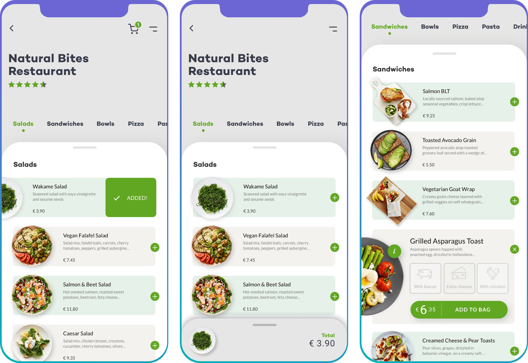
Three possibilities for the list-view ‘add to basket’ interaction; slide to add (left), tap to add, with the basket displayed as a footer overlay (centre), and tap for extras (right)
Add to basket
I explored three possibilities for a quick version of ‘add to basket’, initially considering a swipe left interaction to add items. Unfortunately this didn’t cater for the dishes that had optional extras. And that lack of continuity between elements is bad for usability, hindering the learned behaviours within the app. Elements that look the same should essentially react in the same way as to not surprise the user.
With the second interaction being the strongest I decided that all items would expand upon tap of the + icon, the dish image would animate (expand and rotate) to its new position, a longer item description and additional extras would display, with the price and call-to-action more visible. The + button keeps its position, rotating 45° to become the close icon.
Basket at-a-glance
A common and expected behaviour for dish selection is that a small roundel containing the total number of items is shown over the basket icon in the header. More often than not, this is animated in varying degrees of complexity. Wanting to explore another solution, I toyed with the idea of a basket overlay, sliding in from the bottom of the screen, and showing the items and total price. Tapping this would take the user directly to their shopping basket.

The basket overlay gives a quick overview of the users chosen items and total price
The benefit of this is that the user can keep an eye on the contents, and total price of their basket. But we have to consider carefully how we tackle this element once the user has selected numerous items. Would we incorporate a horizontal sliding view of all items that continue behind the total price, and off the edge of the screen? Or would we expand the element upwards making it taller to fit rows of items? And the biggest problem here is, the entire concept is based on the restaurant having images of their dishes.
This is where the idea crashes down. We must always consider that images might not be available for every single dish. How can we solve that issue? One idea is to use iconography. But then we begin to create further issues for ourselves. An icon set that represents various dishes can be expensive, time-consuming to create, and close to impossible to cover all types of cuisine. It very quickly becomes crazy and complicated.
Product detail and additional information
The product image is displayed centrally (side perspective or top-down perspective) against a clean minimal background. I played with the idea of having clouds or some kind of nature shot in the background but scrapped this later too, as it was too distracting and wouldn’t work on a global scale with each product.
Beneath the image, a title and short description of the product (five lines), with some useful dietary icons (vegan, contains beef, lactose-free, dairy, etc), options to add extras (checklist with dynamic price adding to the total on interaction), number of items selection (- 1 +) and finally the key ‘Add to basket’ call-to-action, that sits above a ‘cancel’ button. The cancel button takes the user back to the restaurants' menu.
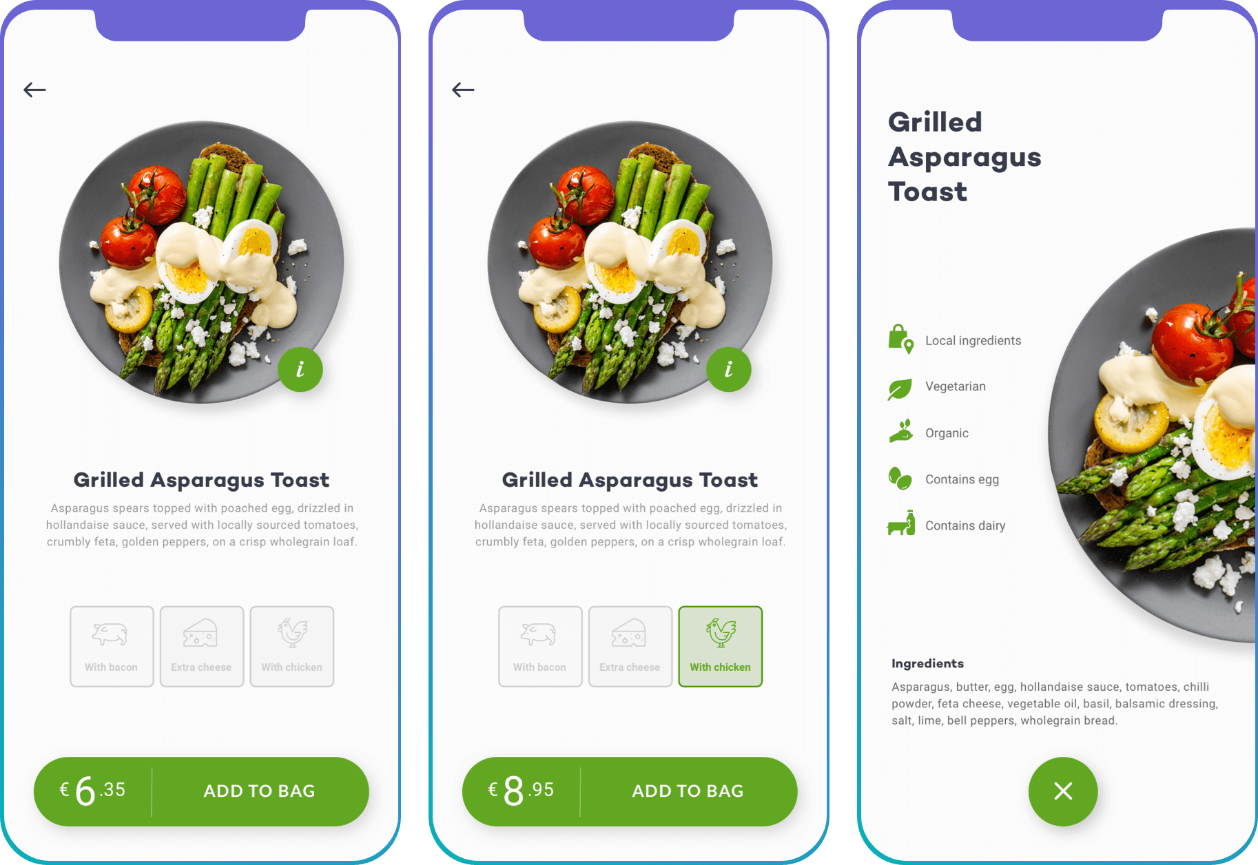
The product detail screen (left and centre), which animates in to an additional information screen (right) when the info icon is tapped
During the design of the wireframe, I decided to position the nutritional information and ingredients to its own screen accessible via an information icon. Tapping this icon would animate the dish in to its new position cropped on the right side of the screen. I also scrapped the ‘Cancel’ button as this felt misleading, and replaced it with a ‘back’ button. I wanted to avoid users thinking this might cancel their entire order (you never know, right).
The layout of this screen relies heavily on having images of the dishes, which again feels relatively unrealistic. Large chains would have no problem with providing product shots, but we also need to consider smaller independent restaurants. A solution to this could be a single generic image that could be used as a placeholder.
Basket overview
Rapidly reaching the deadline for my challenge, I spent the last hours looking at the basket overview. As explained above, once an item is added to the basket, we see a preview of this via an overlay at the bottom of the screen. Sliding this upwards, or tapping the element animates it upwards. And the user sees a detailed overview of their basket (item image, name, listed extras, individual price, and number of that item, plus the grand total (delivery prices would also be included as the last row on the list). Tapping the ‘place order’ button takes the user to payment.
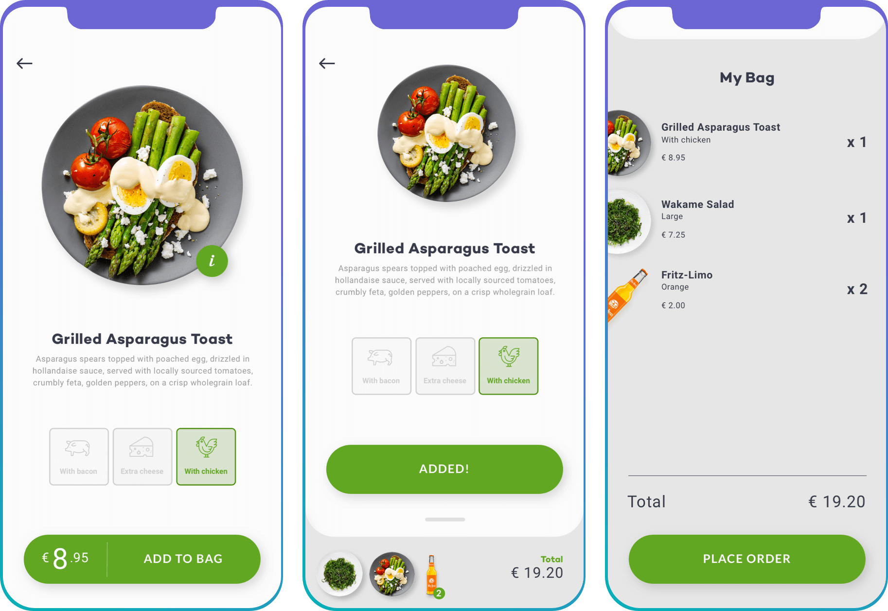
Add to basket (left), basket preview (centre), and detailed basket view (right).
Final thoughts
We stumbled across some basic examples of when a designer has to make the decision between aesthetics and usability. But what should we favour more? Surely the two are entwined?
As designers, we have to deal with both the functionality and look and feel of a product. Creating playful interfaces might be a more enjoyable process than simply going with the obvious solution. If opting for the riskier option, we want to avoid a confused user at all costs as they'll grow confused, and frustrated. So we need to address that, find a way to teach them how to adapt with ease to this new unexpected layout, and make it a smooth ride.
In a world that seems too eager for designers to cookie-cut and duplicate overused design patterns we've seen countless times before, isn't it time we pushed the boundaries a little? The answer to this is, hell yeah...with the right product. But when someone’s reaching for an app to fix their hunger issues, maybe we shouldn’t over-complicate things.


Made with ❤︎ and ☯︎. Copyright Jessica denHeyer 2020 - 2023. All rights reserved.
Made with ❤︎ and ☯︎.
Copyright Jessica denHeyer 2020 - 2023. All rights reserved.